KNUCKLES
Bencher
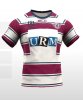
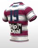
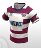
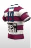
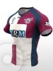
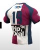
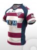
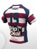
I really wish the club would lose the bronco-esque look i think these jerseys are awful. I like when blue is incorporated it gives the brand more of a beaches vibe look. I made some designs which give an eg and I think are far better than what we have. What you guys think? Obviously the logos need touching up but u get the idea
Attachments
-
 20201122_144815.jpg46.8 KB · Views: 38
 -
 20201122_145000.jpg45.6 KB · Views: 39
 -
 20201122_144226.jpg46 KB · Views: 36
 -
 20201122_144133.jpg40.4 KB · Views: 36
 -
 20201122_144046.jpg38.5 KB · Views: 33
 -
 20201122_144021.jpg38.3 KB · Views: 34
 -
 20201122_143655.jpg40.9 KB · Views: 35
 -
 20201122_143627.jpg42.1 KB · Views: 34
