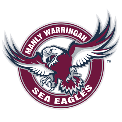
Don’t get me wrong ladies and gents, I love our current logo and I can honestly say it’s one of the best in the league no doubt about it. But there is something about the 70’s logo with the eagle clawing the ball that’s so iconic. Whether it’s the success around it or the simplicity about it I think it’s pretty strong.
The old one has been used by the club frequently the past couple of years on merchandise and in today’s age in sports a lot of clubs around the world are changing their logos to simpler and sharper logos especially to coincide with street apparel as well as the jerseys.
How would everyone around here feel if we were to revert to this classic like shown in this polo or even a few minor modernised changes to it? I for one would actually love it and I wasn’t even around in the 70’s or 80’s for that matter.
(Couldn’t upload the photo so I’ll include the Facebook link instead)
https://www.facebook.com/ManlySeaEagles/posts/10155901688410993