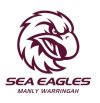
A New Era Awaits
- Thread starter The Wheel
- Start date
-
We had an issue with background services between march 10th and 15th or there about. This meant the payment services were not linking to automatic upgrades. If you paid for premium membership and are still seeing ads please let me know and the email you used against PayPal and I cam manually verify and upgrade your account.
You are using an out of date browser. It may not display this or other websites correctly.
You should upgrade or use an alternative browser.
You should upgrade or use an alternative browser.
Waz13
Let’s all have a chew!
Gee I hope they don’t stuff up with this new emblem. I’m a late 80s early 90s man so I’d love a slight tweak of that logo. Maroon SeaEagle on white background type badge that stands out on the maroon jersey. There’s been sone rubbish logos over the years. Still think the best are the ones that stay a bit original.
Absolutely pointless, and no need at all to change history yet again, the strong logos stand the test of time
Inside word seems to be it’s just going to the head version of the logo
Inside word seems to be it’s just going to the head version of the logo
Just the head? An eagle eye is great, and of course everyone loves a good beak, but what about wings? talons? They are key parts of the package.Absolutely pointless, and no need at all to change history yet again, the strong logos stand the test of time
Inside word seems to be it’s just going to the head version of the logo
Heckenberg
Reserve Grader
Americanising the logo before the Vegas debut. ****
To me it looks way too America sports like logo.From the Facebook video. Bloody shocking.
happy for the club to go in a new direction
but don’t like this new logo one bit.
Last edited by a moderator:
sick_thing
Member
Nice they're letting the local pre-school design emblems now.
"Paying homage to the club's rich history" - No it isn't.
"Paying homage to the club's rich history" - No it isn't.
Heckenberg
Reserve Grader
I actually don’t mind the solitary head. At least it looks mean. It’s the font I hate.
Nordburg
Bencher
Surely the money would of been better spent elsewhere.Id of thought 99% of people would been more concerned about winning than what emblem/ethos the club represents2 years in the making. WOW
Cameron
Make Manly Great Again #Hasler2019
Look I like head as much as the next bloke. But do we need it on a jerseyI actually don’t mind the solitary head. At least it looks mean. It’s the font I hate.
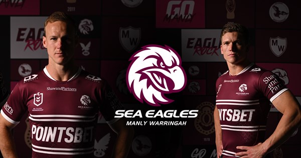
'Manly’s home jersey will also retain the traditional hoops design, a specific reference to uniforms of the past.'
That's a positive at least.
 www.seaeagles.com.au
That's a positive at least.

A new era for the Sea Eagles
Manly Warringah Sea Eagles have unveiled an exciting new identity and emblem that brings a fresh, modern look whilst also paying homage to the Club’s rich history.
conanu
Bencher
Its really just the head of the current logo, its a bit meh to be honest. NFL teams do this but they usually only put these logos on the side of helmets not as the main logo. its like it was designed to suit the circular space on facebook and instagram profile pics. Don’t hate it but its a shame we lost the wings, would have preferred reusing the old original logo
I kinda like it, It looks very current with the simple design. Less is more with branding. A change is always hard to get your head around (Especially after 20 years) but I thinks it’s great we are moving with the times.
Yes it’s a little Americanised but it’s not a bad move considering we want to grown the game and fan base. Our branding needs to be bang on if we are to attract big corporate dollars and show our great club to the world.
Yes it’s a little Americanised but it’s not a bad move considering we want to grown the game and fan base. Our branding needs to be bang on if we are to attract big corporate dollars and show our great club to the world.
Staff online
-
DanKim Jong Dan
| Team | P | W | L | PD | Pts |
|---|---|---|---|---|---|
|
7 | 6 | 1 | 54 | 14 |
|
6 | 5 | 1 | 59 | 12 |
|
8 | 5 | 2 | 39 | 11 |

|
6 | 4 | 2 | 53 | 10 |

|
6 | 4 | 2 | 30 | 10 |
|
8 | 4 | 4 | 73 | 8 |
|
7 | 4 | 3 | 40 | 8 |

|
7 | 4 | 3 | 24 | 8 |
|
7 | 3 | 4 | 17 | 8 |
|
7 | 4 | 3 | -8 | 8 |
|
8 | 4 | 4 | -60 | 8 |
|
8 | 3 | 4 | 17 | 7 |

|
6 | 2 | 4 | -31 | 6 |
|
8 | 3 | 5 | -55 | 6 |

|
7 | 2 | 5 | -29 | 4 |
|
7 | 1 | 6 | -87 | 4 |
|
7 | 1 | 6 | -136 | 4 |
Online statistics
- Members online
- 16
- Guests online
- 831
- Total visitors
- 847
Totals may include hidden visitors.

