Logo looks great. Pity they couldn't have come up with a better slogan as well.....still persisting with "Stronger Together" 
New Logo 2016
- Thread starter Sea Eagle 4 Life
- Start date
-
We had an issue with background services between march 10th and 15th or there about. This meant the payment services were not linking to automatic upgrades. If you paid for premium membership and are still seeing ads please let me know and the email you used against PayPal and I cam manually verify and upgrade your account.
You are using an out of date browser. It may not display this or other websites correctly.
You should upgrade or use an alternative browser.
You should upgrade or use an alternative browser.
double hoops
First Grader
Will we get a old time heritage jersey to match?
Will we get a old time heritage jersey to match?
I assume the Heritage Jersey will be similar to the 76 premiership year jersey
HoldenV8
Journey Man
Luv it. Can't wait to see the boys holding the Telstra trophy next year with this on their jerseys.
I was there at the SFS when Tooves held the Optus Cup aloft at the end of 1996 wearing the 50th anniversary patch on his jumper (it was the first Manly game I saw live in person. I'll never forget that day, or the party in the leagues club that night
Hopefully the boys can do it all again in 2016.
Bones is right. If it's our 70th year then NE never happened...
Rusty Cage
Reserve Grader
Well done with the new logo.
I've thought for a long time that the old sea eagle logo could be kind of like the rabbits logo you see on the back of every second beat up commodore and Hyundai excel.
An instantly recognised brand that any company needs.
Maybe Joe Kelly might be all over this?
I've thought for a long time that the old sea eagle logo could be kind of like the rabbits logo you see on the back of every second beat up commodore and Hyundai excel.
An instantly recognised brand that any company needs.
Maybe Joe Kelly might be all over this?
Loobs
Living in the demountable.
Since they won their last premiership? **** didn't realise it was that bad out west...Shhh nobody tell parra that it is their 70th anniversary too
Hamster Huey
Space Invader
It should say 70th Anniversary.
It's only the 67th year Manly have been in the competition.
Correct, if you simply state the seasons played in the top grade as 'Manly'. But 70 is still correct as the club itself didn't close its doors during NE and I'm sure we still had Manly playing in lower grades.
I was there at the SFS when Tooves held the Optus Cup aloft at the end of 1996 wearing the 50th anniversary patch on his jumper (it was the first Manly game I saw live in person. I'll never forget that day, or the party in the leagues club that night)
Hopefully the boys can do it all again in 2016.
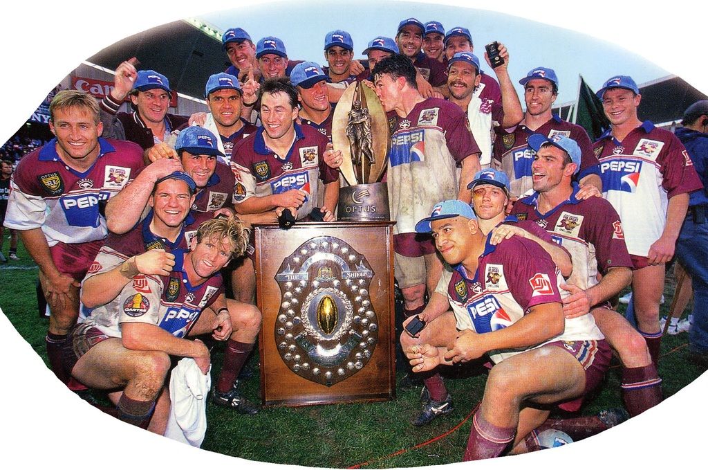
It may not be a picture of Tooves holding the Optus Cup aloft that you described but instead, the whole team group photo which you can sort of see what the 1996 50th anniversary patch looked like.
sheridanstand78
First Grader
I really like the logo. It really represents who we are. I too would like to see the Stronger together campaign replaced with something different as that slogan to me represents all the bitterness of the last 2 years in relation to player contracts and retention when those words did not seem to matter to quite a few players.
Brissie Kid
Bencher
Ditch the Stronger thing & go with "Be Manly".
The white sea eagle carrying a M-W footy should be like the white rabbitohs sticker on every ute etc.
The white sea eagle carrying a M-W footy should be like the white rabbitohs sticker on every ute etc.
Duff
Bencher
Well done with the new logo.
I've thought for a long time that the old sea eagle logo could be kind of like the rabbits logo you see on the back of every second beat up commodore and Hyundai excel.
An instantly recognised brand that any company needs.
Maybe Joe Kelly might be all over this?
Agreed mate. I've been saying that for years. That simple bit of marketing has worked wonders for the bunnies. We are lucky enough to have a similar thing available to us and the club is too stupid to capitalise. Maybe with this years heritage jersey and next years logo they're actually going to move towards it.
Simple and iconic. The hallmarks of great branding.
Ditch the stupid kiddies cartoon character we've had for 20 years and get back to the 60's & 70's image when our club stood for power and dominance.
| Team | P | W | L | PD | Pts |
|---|---|---|---|---|---|
|
5 | 4 | 1 | 23 | 10 |
|
5 | 4 | 1 | 14 | 10 |
|
6 | 4 | 2 | 48 | 8 |
|
6 | 4 | 2 | 28 | 8 |

|
5 | 3 | 2 | 25 | 8 |

|
5 | 3 | 2 | 14 | 8 |
|
6 | 3 | 2 | 38 | 7 |
|
6 | 3 | 2 | 21 | 7 |
|
6 | 3 | 3 | 37 | 6 |
|
6 | 3 | 3 | 16 | 6 |
|
6 | 3 | 3 | -13 | 6 |
|
5 | 2 | 3 | -15 | 6 |
|
6 | 3 | 3 | -36 | 6 |
|
6 | 2 | 4 | -5 | 4 |
|
6 | 2 | 4 | -7 | 4 |
|
5 | 0 | 5 | -86 | 2 |
|
6 | 1 | 5 | -102 | 2 |
Online statistics
- Members online
- 24
- Guests online
- 767
- Total visitors
- 791
Totals may include hidden visitors.
